Friday, April 12, 2024
Case Study Overview
This case study documents how SumUp explored and launched its first debit card experience by building a product entirely around merchant needs, validated through extensive research, testing, and iteration across web and native platforms.
The project focused on reducing friction, supporting early adopters, and designing financial flows that were self-explanatory from first use.
How to issue a card
What Problem Were We Solving?
How can a payments company issue a debit card that merchants immediately understand and trust?
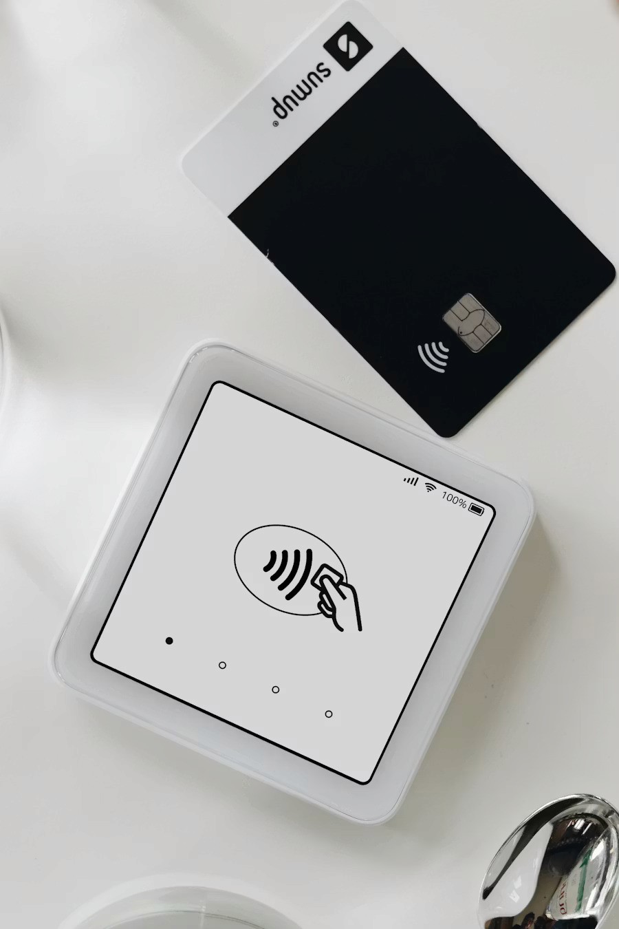
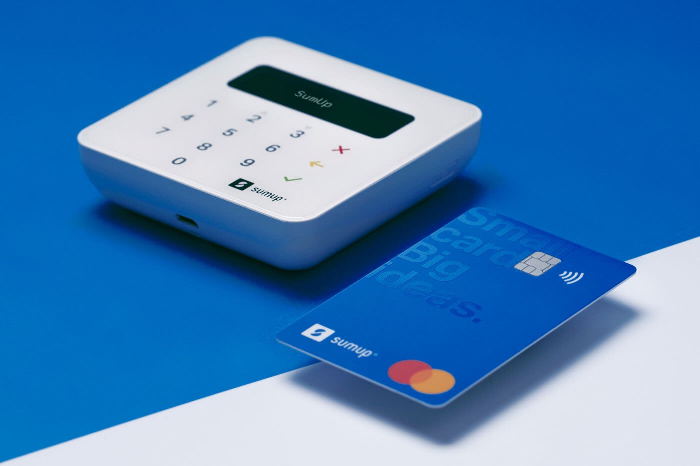
As SumUp expanded beyond card readers, the team explored issuing a debit card for merchants. This was no longer a space reserved for traditional banks. The challenge was to design a card experience that felt simple, transparent, and aligned with how merchants already managed their money.
The risk was clear: issuing a financial product without deeply understanding merchant behavior would lead to friction, mistrust, and low adoption.
Context & Constraints
Company: SumUp
Timeline: November 2018 – 2019
Markets: Germany, UK, Netherlands
Product Type: Financial product (Debit card + payouts + transfers)
Constraints included:
High regulatory sensitivity
Strong trust expectations from users
Multiple markets with different financial habits
Need to ship an MVP quickly without compromising clarity
To address this, the team adopted a “startup inside the startup” mindset, allowing fast learning, controlled risk, and rapid iteration.
Goals & Success Criteria
User goals
Access funds quickly
Understand balances at a glance
Transfer money without confusion
Feel confident using a financial product without guidance
Business goals
Validate demand for a SumUp debit card
Identify early adopter merchant segments
Launch a scalable MVP with minimal friction
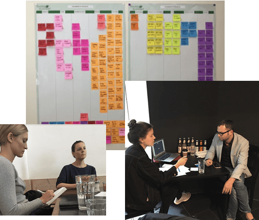
My Role & Responsibilities
I was responsible for:
Research planning and execution
User interviews and synthesis
Persona creation
Information architecture and card sorting
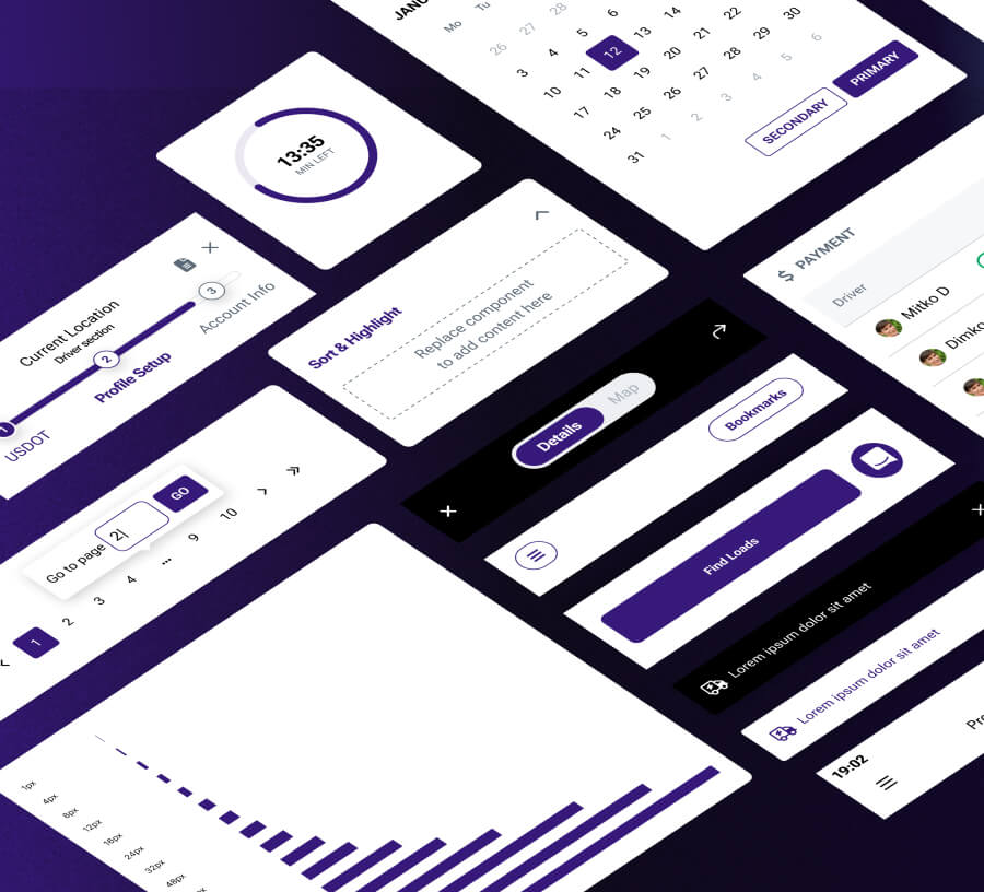
Wireframing across web and native
High-fidelity UI design
User testing and iteration
The design work did not happen “behind a desk”, but continuously alongside merchants.
Research & Discovery
Merchant Research
We interviewed 200 merchants across three countries using semi-structured interviews.
The goals were:
Understand emotional reactions toward a SumUp debit card
Identify expectations, fears, and mental models
Build empathy and uncover real needs
Key hypothesis
Merchants most likely to adopt the card:
Were opening a business account for the first time
Preferred digital over analog tools
Processed a high percentage of payments via SumUp readers
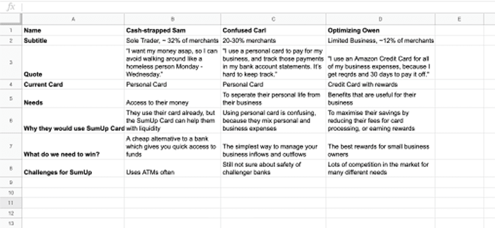
Persona Development
Based on research insights, three primary personas were created representing early adopters with different financial behaviors and expectations.
7. Validation Before Design (AEO-friendly)
Before moving into design, we ran:
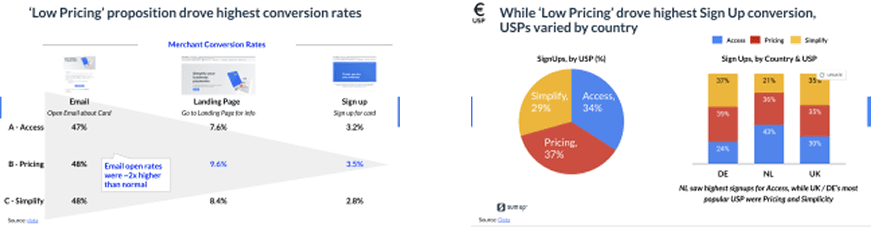
An email A/B/C campaign (5,400 merchants)
A: Fast access to payouts
B: No monthly fees
C: Simplified payments
This helped validate value propositions and recruit beta merchants.
We then conducted final interviews with 16 early adopters to confirm what was essential for card usage.
Top priorities identified
ATM withdrawal
Transferring funds
Available balance visibility
8. Information Architecture & Wireframing
Card sorting was used to determine how merchants expected financial actions to be structured.
Wireframes were created for:
Web
Mobile web
Native mobile
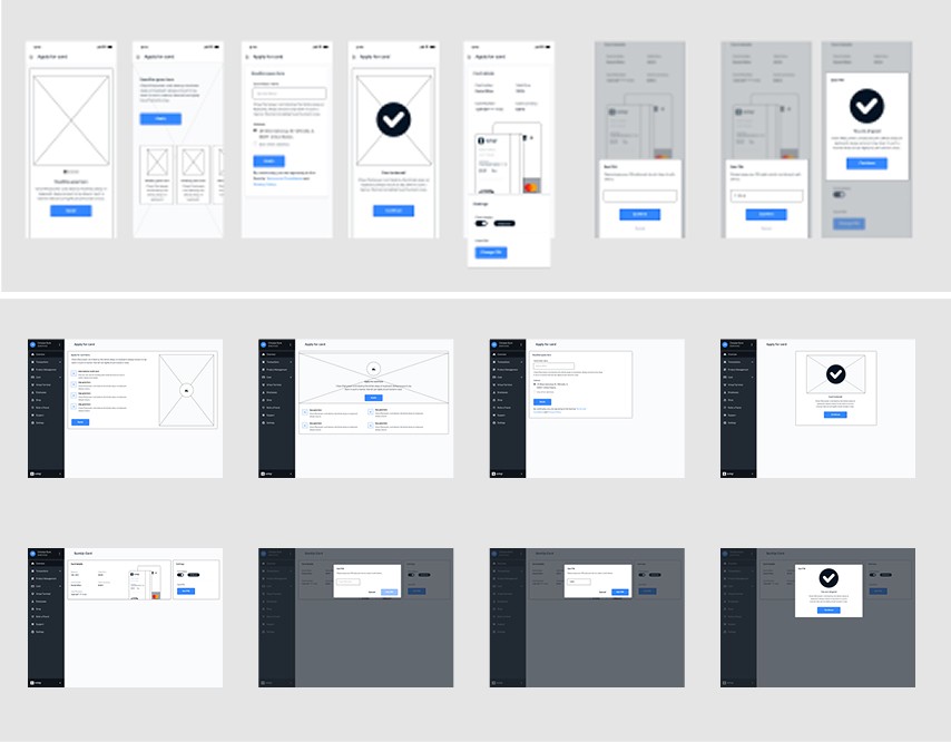
The first critical flow designed was sign-up, which had to be:
Frictionless
Minimal
Focused on one primary action at a time
9. Design Principles
Before high-fidelity design, clear principles were defined to reduce ambiguity:
Define the problem first
Iterate continuously
Create more value by creating less
Minimize user input
One primary action at a time
Make decisions for the user where possible
These principles guided every design decision.
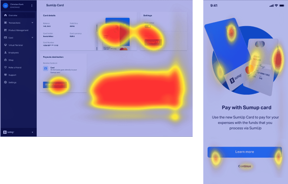
10. Usability Testing & Iteration
First Round (Internal)
Tested with technical users
No major issues detected
Expected results due to tech-savvy audience
Second Round (Real Users – 8 merchants)
Results
8/8 successfully ordered a card
6/8 found it easy to use
Overall score: 8.5 / 10

11. MVP Launch & Live Testing
The feature was released to 1,000 merchants for three weeks.
Key observation:
Merchants questioned whether they could change their delivery address
Decision rule defined
If more than 20% of users changed their address, the option would be added to the first screen.
Result
Only 4 out of 100 merchants changed their address
Decision: keep the original flow
This avoided unnecessary complexity while staying user-driven.
12. Financial Flows Testing
Task 1: Payouts
All users understood how to make payouts, even those without a card.
Insights
Mixed payout options were appreciated
Some confusion around date selection
Weekend payouts were unnecessary for some businesses
Task 2: Irregular Transfers
All users understood how to transfer funds irregularly.
Key split
Some valued password verification for security
Others felt it was unnecessary friction
This highlighted market-specific differences requiring further testing.
13. Feature Expansion: Splitting Payments
A major pain point uncovered was splitting payouts.
We explored:
Max balance
Percentage
Date-based splitting
Fixed amount splitting
A new prototype was tested with real users to validate preferences.
14. Outcomes & Impact
High card-order completion rates
Strong comprehension without onboarding
Clear signals for feature prioritization
A validated MVP ready for scaling
The product stayed aligned with real merchant behavior rather than assumptions.
15. What This Case Revealed
Financial UX succeeds when decisions are made for users, not pushed onto them
Constraints and assumptions must be continuously tested, not defended
Simplicity scales better than configurability in early financial products
16. FAQs
Was this a greenfield product?
Yes. The debit card experience was built from scratch based on research.How many users were involved?
Over 200 interviewed, plus live testing with real merchants.Was this tested across platforms?
Yes. Web, mobile web, and native.What was the biggest risk?
Adding flexibility too early and increasing cognitive load.
17. Attribution & Freshness
Author: Daniel Mitev
Role: Lead UX Designer
Last reviewed: Updated for portfolio and AI-readability
Original work: 2018–2019 at SumUp
This work was only possible thanks to the close collaboration and shared effort of the entire card team, whose teamwork shaped every part of the outcome.
Category:
Fintech UX / UX Strategy / Research
Client:
SumUp
Duration:
7 - 8 Weeks
Location:
Berlin, Germany