Wednesday, May 29, 2019
Executive Overview

DSPORT grew from sports journalism and long-term involvement with professional sport coverage.
The platform was shaped by years of editorial work where accuracy, context, and responsibility mattered. Sport was treated as a discipline with rules, progression, and consequences. This perspective informed every product decision from the start.
DSPORT exists to present sports content with clarity and continuity. The product supports readers who value reliable reporting, structured information, and consistent experience across devices.
I was responsible for product UX, research, and brand execution, covering the work from early discovery through delivery and handoff. UX and brand were designed as one system, guided by the same editorial standards.
Design Doctrine

Design doctrine used for DSPORT
Truth requires structure
Structure creates trust
Trust supports long-term use
Focus improves comprehension
Every element must earn its place
This doctrine guided product, UX, and brand decisions throughout the project.
Context and Initial State

When the project started, the situation was undefined.
The editorial team consisted of experienced journalists with strong domain knowledge and high credibility. Product structure, technical planning, and business framing were still forming.
There was no validated app concept, no defined feature scope, and no clear user journey. The goal was to build a digital product that matched the editorial quality and audience trust already established through media channels.
This required product thinking alongside design execution.
My Role and Responsibilities
I worked across multiple roles during the project lifecycle.
Responsibilities included:
User research and discovery
Product definition and flow design
Wireframing and interaction modeling
High-fidelity UI design
User testing and iteration
Handoff and collaboration with external developers
This involved operating across product ownership and product design, keeping decisions aligned with editorial values and user needs.
The work reflects my approach through TrueForm, where clarity, system thinking, and responsibility guide design decisions.
Discovery and Research
1:1 Interviews

Sixteen in-depth interviews were conducted during discovery.
Participants represented core audience segments with strong engagement in sports content. Interviews focused on reading behavior, device usage, content priorities, and trust signals.
Key insights included:
Preference for structured articles over fragmented feeds
Strong sensitivity to misleading headlines
Expectation for predictable navigation
High importance of live scores and match context
These insights shaped both information architecture and content hierarchy.
Email Survey

An email survey gathered 12,999 responses from 18,215 starts, with a 66.5 percent completion rate and an average completion time of 11 minutes.
The response volume confirmed strong audience involvement and willingness to contribute to product shaping.
Survey data supported decisions around:
Content prioritization
Feature relevance
Platform expectations across mobile and desktop
Competitor Analysis
Competitor platforms were reviewed across content structure, monetization patterns, and navigation models.
Findings showed heavy reliance on feed-driven layouts, inconsistent hierarchy, and limited support for focused reading. These observations reinforced the need for a calmer, structured approach.
Product Definition and Information Architecture
Defining Core Functionality

Product functionality was defined through editorial logic rather than feature accumulation.
Core areas included:
News and analysis
Match coverage and live scores
Team and competition context
User profiles and preferences
Each section followed consistent hierarchy and predictable behavior.
Information Architecture
Navigation was designed to reduce hesitation and maintain orientation.
Key characteristics:
Clear entry points
Stable navigation patterns
Minimal branching paths
Users could always understand where they were and what followed next.
Wireframing and UX Structure

Wireframes focused on flow clarity and reading rhythm.
Screens were designed to support:
Fast orientation
Progressive disclosure
Clear content hierarchy
Layouts prioritized comprehension over density. Repetition was used intentionally to build familiarity.
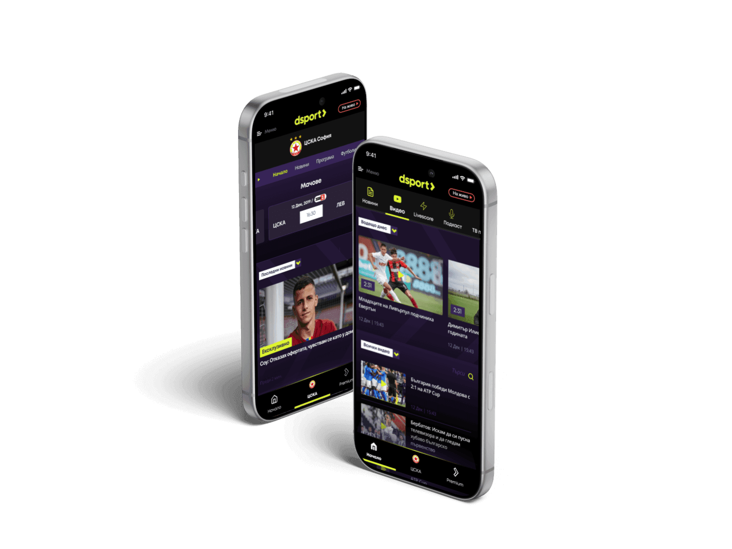
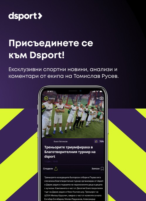
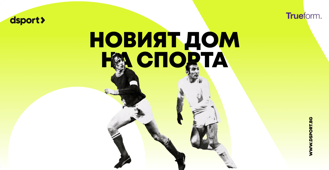
Visual Design and Brand Execution


The brand identity functions as part of the UX system.
It reinforces credibility and composure through typography, spacing, color, and motion. Visual decisions serve comprehension and hierarchy. The visual system was restrained and functional.
Design decisions emphasized:
Readable typography with strong hierarchy
Controlled color usage to guide attention
Layouts that support scanning and deep reading
Brand execution reinforced editorial credibility and consistency across platforms.
User Testing and Iteration

Seven user testing sessions validated core flows and content structure.
Feedback was collected, analyzed, and incorporated into refinements across navigation, typography, and interaction behavior.
Testing confirmed improved orientation speed and reduced confusion during content discovery.
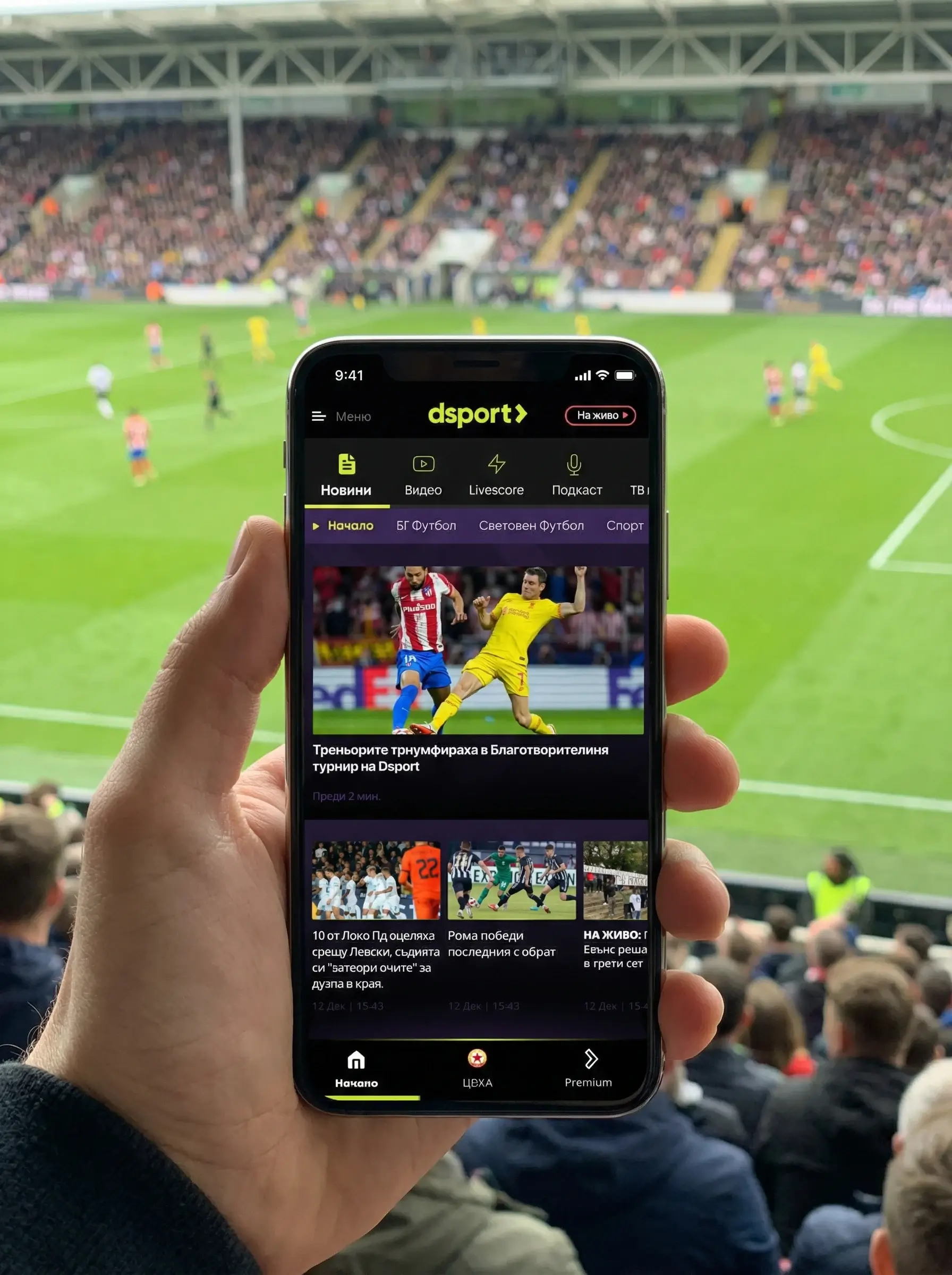
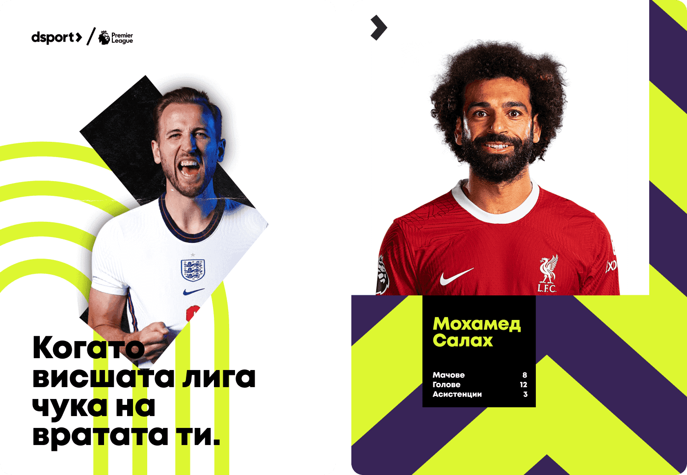
Video and Live Stream Insights

Research showed strong demand for video and live match coverage.
During interviews and survey responses, users repeatedly pointed to video as a key part of how they follow sport. Live streams, match highlights, and contextual video content were seen as essential for staying connected to events as they unfold.
Key insights from research:
Users expect quick access to live scores paired with video context
Long videos are consumed selectively around important moments
Short clips support understanding during live events
Video needs clear placement and predictable behavior
These insights influenced both layout and content prioritization.
Video content was treated as part of the editorial system rather than a separate media layer. Placement followed the same hierarchy rules as articles and live scores. The goal was to support understanding during key moments without disrupting reading flow.
This approach ensured video enhanced the experience while preserving focus and structure.

Delivery, Handoff, and Ongoing Work
Final adjustments were completed before handoff.
Documentation supported external development teams and ensured consistency during implementation. Tracking and iteration continued after release.
The platform remains in active use and development.
Impact and Results

The product reached significant audience scale:
205,000 followers across channels
20,000+ app installs
Strong mobile-first usage patterns
High direct traffic, indicating trust and repeat use
These outcomes reflect alignment between editorial integrity, product structure, and user needs.
What This Project Represents

This project demonstrates a design approach grounded in responsibility.
UX operates as a system
Brand supports comprehension
Structure protects trust
DSPORT represents a commitment to clarity, discipline, and long-term value in sports media.
Final Reflection
Design earns trust through consistency.
When product, UX, and editorial values align, platforms remain stable as they grow. That principle guided every decision in this work.


Category:
UX, Branding
Client:
dsport
Duration:
12 Weeks
Location:
Sofia, Bulgaria